The Future of Caddie Management is Here
Eliminate operational chaos. Empower your team to deliver exceptional member experiences with intelligent automation.
Turn Admin Time into Member Value
Assigning loops is now the easy part creating a world-class experience where your team shines. Handicaddie cuts out hours of manual scheduling so your caddie master can focus on member interactions, communication, and service. The result: less admin, more value where it matters.


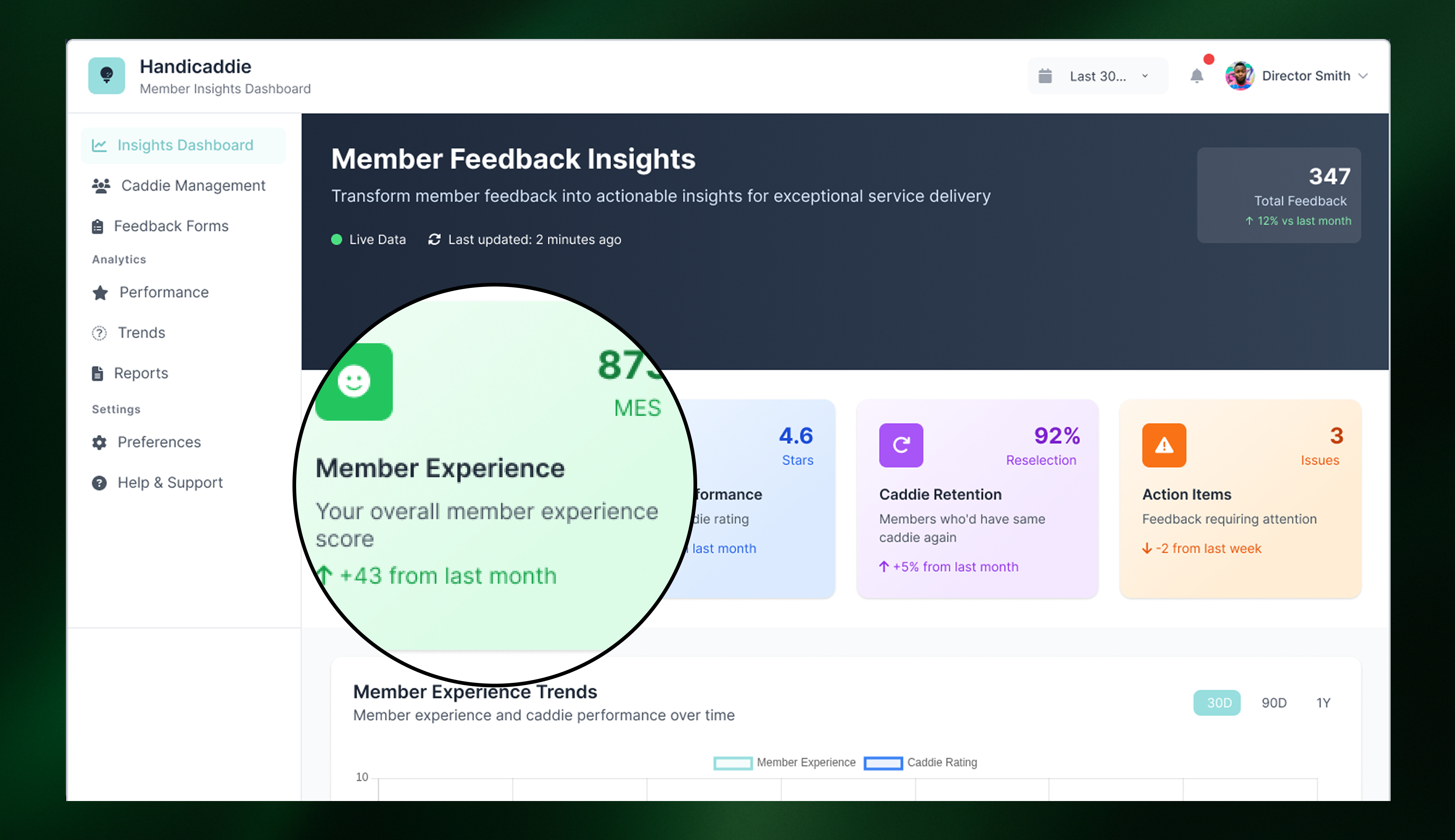
World’s First Member Experience Score
Caddie Programmes are a member research tool that’s been hidden under your nose. Handicaddie collaborates with caddies as a unique touchpoint to uncover hidden demand from your members, providing one score for member experience.
Capabilities
Built for Excellence
Purpose-built for the operational demands of prestigious clubs.
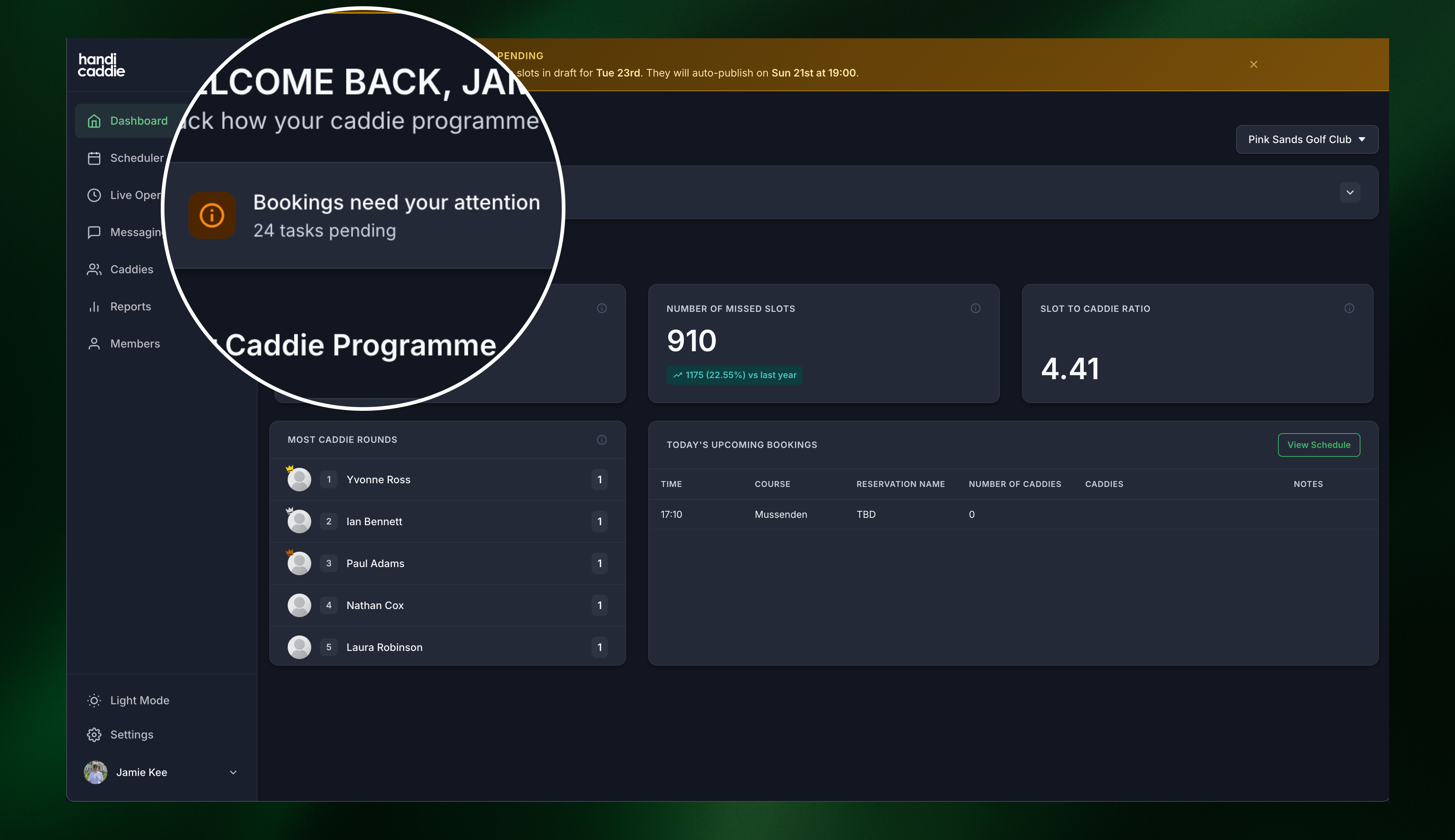
Intelligent Task Management

- Unique task board which empowers caddie masters to deal with last-minute changes.
- Notify your entire caddie force about last minute job opportunities with one button.
- Track when caddies accept their loop with Handicaddie's unique traffic light system.
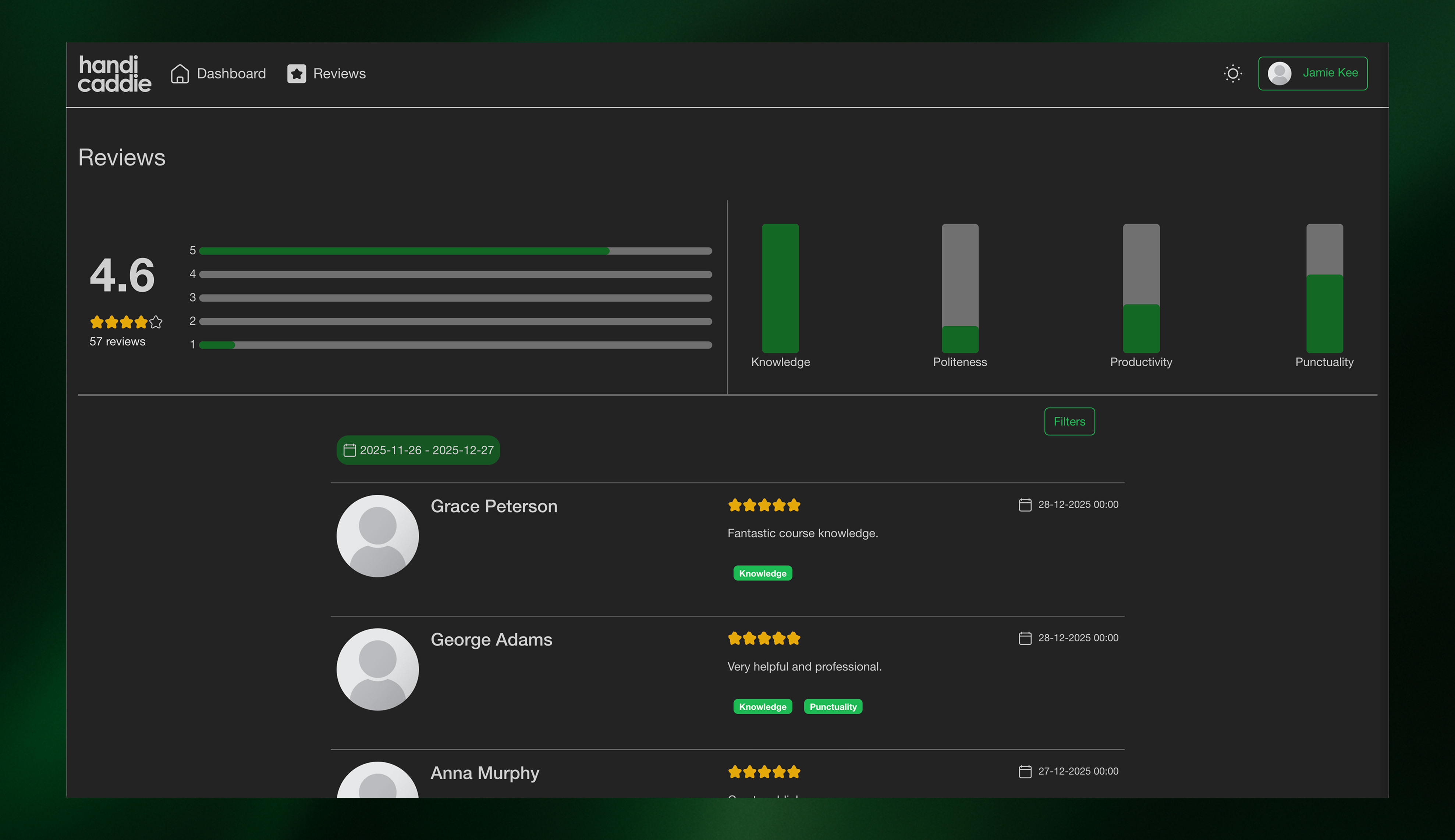
Caddie Analytics

- Unique insights on caddie performance to raise the bar of member experience.
- Access all reports on the jobs completed by each caddie throughout the year.
- Build your database of caddies and provide seamless onboarding of new independent contractors.
Mobile Apps
Dedicated iOS and Android apps for your caddies and members
Cashless Payments
Your caddies can be paid securely and instantly from your members via our app.
Dedicated Onboarding
Bespoke onboarding sessions for your team to hit the ground running in your first 30 days.
Seamless Integrations
Connects with major tee sheet software systems, resulting in seamless scheduling.
Client Testimonial
Trusted by Industry Leaders
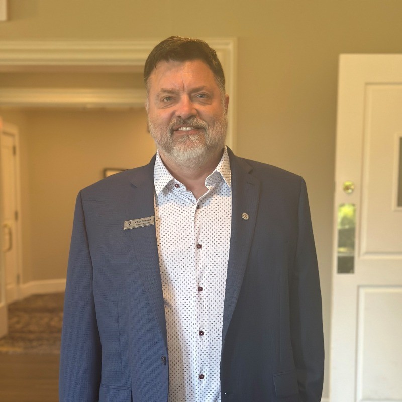
"Handicaddie were extremely helpful in streamlining some of the administrative processes that Royal Melbourne was previously juggling as part of its caddie program. The software is easy to use, intuitive for both caddies and club employees and was well received by all. Handicaddie were very responsive and helpful along the way"

Christopher Stewart
General Manager
Royal Melbourne Country Club
Get Started
Ready to Transform Your Operations?
Schedule a consultation to discover how Handicaddie delivers measurable results for premier clubs.
Dedicated Onboarding
Bespoke onboarding sessions
Performance Guarantee
Measurable ROI within 90 days
Priority Support
Dedicated success manager
Trusted by World-Class Clubs
Partnered with Leading Software Providers
100K+
Rounds Managed
4,000+
Active Caddies
25+
Elite Clubs